Learn how to create sequence diagram online instantly with AI tools. A simple guide to transforming text into professional UML diagrams quickly.
Let’s be honest: wrestling with clunky drag-and-drop tools to map out system interactions is a frustrating time sink. The good news is that you can forget all that. Today, the smartest way to create sequence diagrams online is with an AI-powered tool like DocuWriter.ai. These platforms can take a simple text description of what you need and spin up a professional, accurate diagram in just a few seconds.
This makes visual communication a practical, everyday part of any project, not a chore saved for special occasions.
Create your first sequence diagram in seconds with DocuWriter.ai →
This isn’t just a small step up in speed; it’s a fundamental shift in accessibility. For years, making these diagrams meant learning a specific piece of software and painstakingly dragging shapes and arrows around a canvas. It was tedious, slow, and often created a bottleneck where only a few people on the team could actually produce or, worse, update the visuals.
The modern approach completely flips that script. Now, anyone—from a senior dev mapping out a complex service to a business analyst clarifying a user flow—can just describe the interaction in plain English. The result? An instant visual representation. We’ve moved from manual drawing to intelligent, text-to-diagram generation, and it’s a huge deal for software development and systems analysis.
This new method breaks down the old barriers. It means teams with a mix of technical backgrounds can finally collaborate on visuals without a steep learning curve. Imagine a product manager wanting to spec out a new feature. Instead of writing a long document and waiting for an engineer to diagram it, they can draft a quick prompt and generate a diagram to kick off the conversation immediately.
Just look at how simple the starting point is with a tool like DocuWriter.ai.
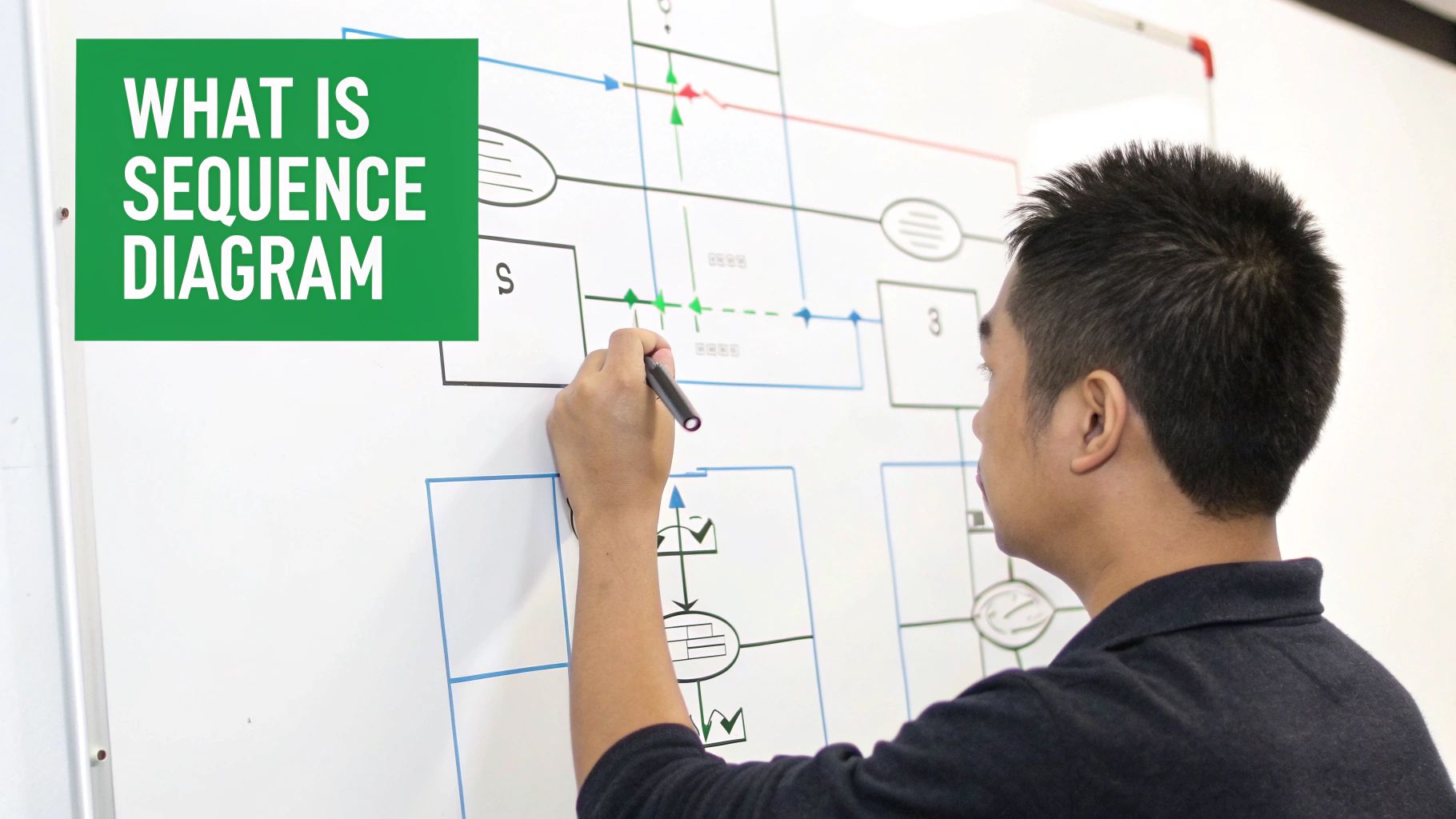
The interface is clean and gets right to the point, letting you concentrate on your system’s logic instead of getting bogged down in the mechanics of drawing.
To really see the difference, it helps to compare the AI-driven approach with traditional methods. One is about speed and conversation; the other is about manual precision and control.
Here’s a practical look at how they stack up.
While traditional tools still offer granular control for very specific layouts, the AI approach is built for the speed of modern development. It prioritizes clear communication and rapid iteration over pixel-perfect manual adjustments.
This shift isn’t just anecdotal; the market data backs it up. The global market for online diagram editors was already valued at around USD 1.8 billion in 2023. Projections show it expanding to roughly USD 6.5 billion by 2033, with a powerful compound annual growth rate of about 13.5%.
This explosive growth isn’t happening by accident. It highlights a massive and increasing demand for better ways to communicate complex ideas visually across all industries. AI-powered diagramming tools are perfectly positioned to meet that need, making sophisticated system design more accessible than ever before. For a deeper dive, you can explore more data on the online diagram editor market.
To really get the hang of creating a sequence diagram online, especially with an AI tool like ours, you have to understand the building blocks. Forget the textbook definitions for a minute. Let’s think about it in a way that actually makes sense.
Imagine you’re logging into your favorite mobile app. That entire process, from tapping your screen to seeing your home feed, is a perfect real-world scenario. A sequence diagram simply maps out that conversation between all the moving parts.
Think of it as a comic strip that reads from top to bottom, showing what happens and in what order.
First up, you have your lifelines and actors. An actor is just anyone or anything outside your system that kicks things off. In our login example, that’s you, the User.
A lifeline, on the other hand, represents a piece of the system itself. This could be the Mobile App, an Application Server, or a separate Authentication Service. In the diagram, each of these gets its own vertical dashed line, showing it exists throughout the interaction.
User who taps the ‘Login’ button.Mobile App, App Server, and Auth Service that have to do the work.Getting this right is your first step. When you start writing a prompt for an AI diagramming tool, you’ll define these participants first. For example, you might tell it, “Show a User logging into a Mobile App that talks to an App Server and an Auth Service.” That simple sentence sets the entire stage.
Once you’ve identified your cast of characters, it’s time to show how they interact. This is where messages come in. These are the horizontal arrows jumping between lifelines, showing who’s talking to whom.
A solid arrowhead usually means the sender is waiting for a reply (a synchronous call). An open arrowhead can mean the sender just fires off the message and moves on (asynchronous).
In our login flow, the Mobile App sends a message to the App Server with your credentials. The App Server then has to send its own message to the Auth Service to check if you are who you say you are.
As these messages get passed around, you’ll notice thin rectangles called activation boxes popping up on the lifelines. These show when a component is actively working on something. For instance, an activation box would appear on the Auth Service lifeline while it’s busy verifying your credentials.
This gives you an at-a-glance understanding of which parts are busy and for how long. It’s this intuition that helps you spot bottlenecks or weird logic when you create sequence diagrams online.
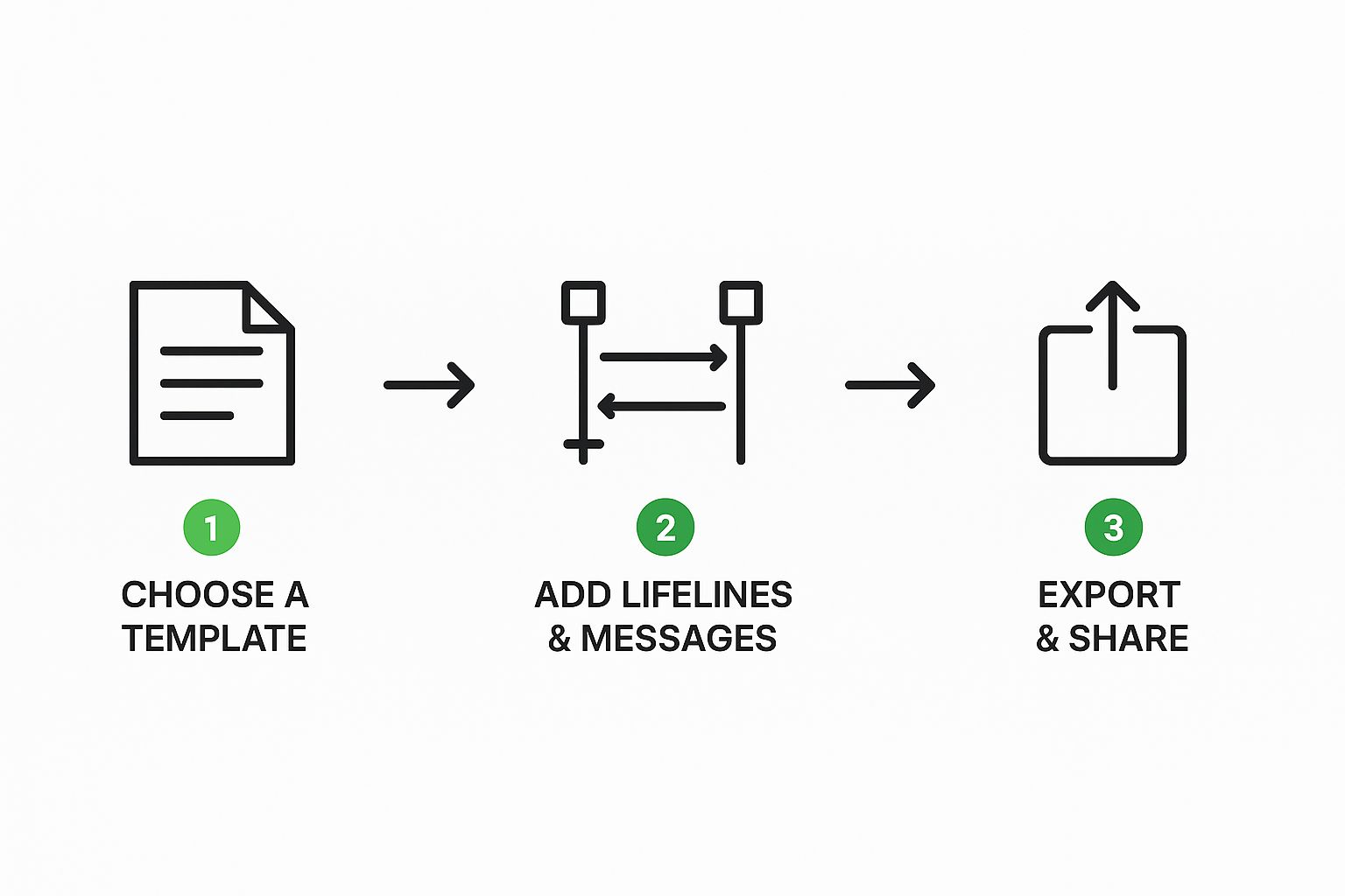
Alright, let’s move from theory to practice. This is where the magic happens—we’ll create a sequence diagram online, taking a simple idea and turning it into a polished, professional visual with an AI tool like DocuWriter.ai.
The key here isn’t to get it perfect on the first try. Think of it more like a conversation with the AI, where you refine and build upon its initial output to get exactly what you need.
To make this a real-world exercise, we’ll tackle a classic e-commerce scenario: a customer adding an item to their shopping cart. This interaction is a great example because it involves a few different players: the customer, the website’s frontend, the backend server, and an inventory service.
First things first, you need to describe the process in plain English. Your goal is to be clear, not to load it up with technical jargon. I usually start by outlining the main participants and the “happy path”—that’s the sequence of events where everything goes exactly as planned.
Here’s the kind of starting prompt I’d write:
This prompt is solid because it clearly defines who’s involved and the successful flow of messages. It gives the AI a perfect foundation to generate a baseline diagram.
Pop that initial prompt into DocuWriter.ai, and you’ll get a clean, though basic, diagram showing that successful flow.
As you can see, a descriptive prompt on the left is instantly converted into a clear sequence diagram on the right. This gives you an immediate visual to start working with.
A good diagram covers more than just the happy path. Real-world systems are full of edge cases and alternative flows, and this is where that “conversation” with the AI becomes so important. Now, we’ll use follow-up prompts to add more detail.
Let’s start by handling the case where an item is out of stock. A follow-up prompt might look like this:
This prompt introduces conditional logic, which instantly makes the diagram more useful for developers who need to code for both outcomes. Next, let’s make the messages a bit more specific.
This adds a layer of technical detail and clarifies the “why” behind an interaction—a best practice for creating genuinely helpful documentation.
Whether you’re doing this manually or with AI, the core actions are pretty much the same. You’re adding lifelines and messages to map out a process.
By having this back-and-forth, you essentially co-create the final diagram with the AI. You supply the high-level logic and the necessary corrections, while the tool does the heavy lifting of redrawing and reformatting everything perfectly. This process aligns perfectly with general UML principles. For anyone who wants to dig deeper, you can learn more about how to create UML diagrams and the standards that guide them.
This iterative approach ensures your final diagram isn’t just a pretty picture, but a precise and robust reflection of how your system actually behaves.
Let’s be honest, a diagram that’s technically correct but impossible to understand is just noise. The real magic happens when you create visuals that are clean, easy to maintain, and act as genuine communication tools for your entire team. Getting this right turns a simple chart into a trusted source of truth that people actually want to use.

The biggest mistake I see people make is mixing different levels of detail. You have to maintain a consistent level of abstraction.
It’s confusing when a diagram shows a high-level UserService interacting with a Database but then suddenly dives into a low-level detail like a formatString(username) message. Stick to the big picture. If a specific interaction is complex enough to warrant more detail, give it its own separate, more granular diagram. This approach keeps each visual clean and focused on a single purpose.
The names you pick for lifelines and messages have a massive impact on readability. Vague labels like Service A or doStuff() force your colleagues to guess, which completely defeats the point of making a diagram in the first place.
Over the years, I’ve landed on a simple convention that works wonders:
PaymentGateway or NotificationService.processPayment() or sendEmailConfirmation().This small bit of discipline can save your team from countless hours of confusion and unnecessary debates.
Another crucial skill is knowing when to stop. Don’t fall into the trap of trying to cram an entire system’s workflow into one monstrous diagram. If a process has more than seven or eight major steps, that’s a clear signal it should be broken down into smaller, more digestible diagrams. To really master this, it helps to understand some key business process mapping techniques.
One of the most powerful but underused features in sequence diagramming is the humble note. A message like validateToken() shows you what is happening, but a well-placed note can explain why it’s happening.
For instance, you could add a note next to validateToken() that says, “Ensures the user session is still active before proceeding with the transaction.” This tiny piece of context is immensely helpful for new developers or anyone jumping into an unfamiliar part of the codebase. This is a core tenet of good documentation, and you can find more tips like this in our guide to software documentation best practices.
It’s clear that more teams are catching on to the value of clear visual communication. The global online diagram editor market is projected to grow from USD 0.98 billion in 2025 to USD 1.85 billion by 2034. By applying these best practices when you create sequence diagrams online, you’re making sure your work is part of that value, not just adding to the noise.

While AI-powered platforms like DocuWriter.ai bring incredible speed to the table, every experienced developer knows that the “best” tool really depends on the job at hand. The goal isn’t to find a single tool and use it for everything. It’s about building a mental toolkit to pick the right one for a specific task, whether that’s rapid prototyping, a team brainstorming session, or generating secure, formal documentation.
Let’s break down the main categories you’ll encounter.
There’s a whole class of tools built for developers who practically live in their code editor. I’m talking about the text-to-UML engines.
Tools like PlantUML and Mermaid are fantastic because they let you treat diagrams as code. You just write a script using a simple markup language, and the engine spits out the diagram for you. The biggest win here is that your diagrams can be version-controlled in Git right alongside your application’s source code.
This is a game-changer for keeping documentation synced with the actual system. When you push a code update, you can update the diagram’s text file in the same commit. No more chasing down outdated visuals on a separate drive or buried in a wiki somewhere.
On the other end of the spectrum, you have your digital whiteboards. Tools like Miro and Lucidchart absolutely shine when it comes to free-form, real-time collaboration. They are less concerned with strict UML notation and much more about getting ideas out of your head and onto a canvas during a team workshop.
These platforms are your go-to for:
Finally, some tools are laser-focused on doing one thing exceptionally well, often with a heavy emphasis on privacy. When you need to create a sequence diagram online but are dealing with sensitive system information, these specialized editors are an excellent choice.
A great example is SequenceDiagram.org, a tool that’s been around since 2014. It cleverly combines a text-based editor with a drag-and-drop interface, giving you the best of both worlds: speed and fine-grained control. Most importantly, it processes everything on the client-side, which means your diagram data never leaves your browser. This is a non-negotiable feature for anyone working with proprietary or confidential system logic. You can read more about its unique approach on their site.
Ultimately, picking the best tool comes down to your immediate need. For quick, accurate, and shareable diagrams based on system logic, an AI tool like ours is unmatched. For code-centric documentation that lives with your repo, text-to-UML is king. And for live, collaborative ideation with your team, a digital whiteboard is your best friend.
Once you start making sequence diagrams more regularly, a few practical questions always seem to come up. These are the real-world snags teams hit when they move from theory to actually using these diagrams day-to-day. Based on my experience helping teams get their diagrams right, here are some straightforward answers.
This is a classic point of confusion, but the distinction is actually pretty simple. It all comes down to what you need to communicate.
You’ll want a sequence diagram when the timing and order of interactions between different components are the most important part of the story. Think of mapping out an API call, a user login process, or any scenario where multiple systems are “talking” to each other. That’s its sweet spot.
A flowchart, on the other hand, is much better for showing the steps of a single process, usually from one system’s or one person’s point of view. It’s fantastic for showing decision points and general workflow logic, but it doesn’t really care about the timeline.
You’ve seen how AI-powered tools can transform a simple text description into a professional sequence diagram in seconds. No more wrestling with complex software or spending hours perfecting layouts. The future of diagramming is here, and it’s faster, smarter, and more accessible than ever.
Try DocuWriter.ai free today and experience the difference. Describe your system interaction in plain English, and watch as your sequence diagram comes to life instantly. Whether you’re documenting an API flow, mapping out a user authentication process, or explaining a complex service interaction to your team, you’ll have a polished, professional diagram ready in moments.
Start creating better documentation today—no credit card required, no learning curve, just results.