Build scalable and consistent interfaces with this complete guide to design system architecture. Learn about layers, patterns, tools, and best practices.
Think of design system architecture as the master plan for your product’s user interface. It’s not just a collection of rules, but a living framework that organizes everything from the tiniest design tokens all a way up to your most complex, interactive components.

Trying to build a product without a design system architecture is like trying to build a skyscraper without a blueprint. Sure, individual teams might put up some impressive-looking floors, but good luck getting them to line up. Walls won’t connect, wiring will be a mess, and the whole structure will be unstable and a nightmare to maintain. That’s the path to inconsistency, duplicated effort, and endless rework.
A well-defined architecture is what saves you from that chaos. It’s the structural guarantee that every button, form field, and layout grid is built from the same core DNA, creating a seamless user experience across your entire product line. This isn’t just about looking good—it’s about building user trust and making your product feel reliable and intuitive.
Right away, the biggest win from a structured framework is how it supercharges collaboration and efficiency. When designers and developers are speaking the same language and pulling from a single source of truth, handoffs become painless and development cycles get faster. Teams can stop reinventing the wheel for every new feature and start assembling UIs with pre-approved, battle-tested components.
This structured approach pays off in a few key ways:
The whole industry is catching on to the need for this kind of structure. The market for architecture design software, for example, jumped from ****6.05 billion recently. That’s a pretty clear signal that precision and systematic design are in high demand.
Of course, this blueprint is only useful if it’s well-documented and easy for everyone to access. Tools like DocuWriter.ai can make this critical process much smoother, ensuring your architecture stays a reliable guide for the whole team. For a deeper dive into the basics, check out our guide on building better products with software design systems.
To build a design system that actually works and doesn’t just sit on a shelf, you have to get the foundations right. Think of it like building a house. You don’t start with the paint colors; you start with a solid foundation and a strong frame.
Everything else is built on top of these core layers. Get them wrong, and the whole structure becomes wobbly and unreliable.

The very bottom layer, the bedrock of the entire system, is made up of design tokens. These are the primitive values—the raw DNA of your brand’s visual identity. They aren’t the design itself, but rather the single source of truth for things like colors, fonts, spacing, shadows, and even animation speeds.
Imagine your primary brand color. Instead of scattering the hex code #007BFF all over your codebase, you create a token named something like color-brand-primary. This small act of abstraction is a game-changer. When the marketing team decides on a rebrand, you just update that one token value, and the new color ripples through every button, header, and link instantly. That’s how you maintain consistency without going insane.
One layer up from tokens, you’ll find components. If tokens are the raw materials like bricks and lumber, components are the pre-fabricated parts of the house—the windows, doors, and staircases. These are your reusable UI elements: buttons, form inputs, modals, and navbars, all built using your design tokens.
For example, a Button component doesn’t have a hard-coded color. It pulls its styling directly from your tokens, like background-color: var(--color-brand-primary). This ensures every single button looks and feels exactly as it should, by default. Developers can then grab these pre-built, on-brand components to assemble new features quickly and confidently. To see how these pieces fit into the larger puzzle, check out our guide on the essential components of system design.
This isn’t just a niche practice anymore. The industry is waking up to the power of this layered approach. Data from a recent report shows design token adoption among engineering teams skyrocketed from 56% to 84% in just one year. It’s a clear signal that this is the new standard for building scalable products. You can dig into more of those engineering trends in this insightful design systems report.
Here’s a critical truth: a design system isn’t just a design project. It’s an engineering product, and it lives or dies based on the partnership between designers and developers. The most successful architectures are co-owned from day one.
Engineers are the ones who turn abstract tokens and static Figma components into a living, breathing codebase. They’re responsible for making sure it’s performant, accessible, and genuinely easy for other developers to use.
Without that deep collaboration, a design system is nothing more than a glorified sticker sheet. It becomes stale, diverges from the real product, and ends up creating more friction than it solves.
This partnership is held together by one thing: clear, accessible documentation. If people don’t know how to use the system, they won’t. It’s that simple. A poorly documented system is a useless system.
This is where automation becomes your best friend. Instead of spending countless hours manually updating guides, you can use a tool like DocuWriter.ai to generate and maintain the clear, accurate documentation that turns your design system from a good idea into an indispensable tool for your entire team.
So, you’ve got your foundational layers of tokens and components sorted. What’s next? Now we get to the “how”—the architectural patterns that give a design system its real structure and strength.
Think of your components as a big box of LEGO bricks. They’re useful on their own, for sure. But their true power is unlocked when you follow a blueprint to build something complex and cohesive. The right design system architecture is that blueprint.
This structure isn’t just about making things look good; it’s about building a product that’s actually maintainable and scalable. It means carefully organizing the different layers of the system—presentation, logic, data—to ensure they all play nicely together. Nailing this choice is critical for speeding up development, sidestepping technical debt, and building products that can evolve without shattering.
At the heart of any modern design system architecture is modularity. This approach is a game-changer. It means treating your user interface as a collection of independent, interchangeable parts. Instead of building massive, monolithic pages where every element is tangled up with everything else, you build small, self-contained components that can be snapped together in endless combinations.
This idea is often explained through the principles of atomic design. You start with simple “atoms” (like buttons or input fields), combine them into “molecules” (a search bar with a button), which then form “organisms” (a complete header section). It’s a beautifully simple way to manage complexity.
This diagram shows you exactly how those simple elements build upon each other to create sophisticated user interfaces.
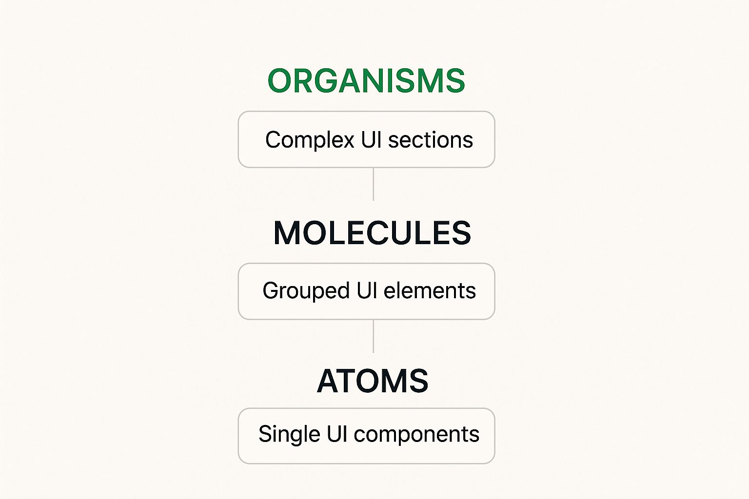
The key takeaway? You manage complexity by composing simple, well-defined parts. This makes the entire system easier to understand, test, and maintain down the road.
When you dig into architecture, you’ll mainly hear about two patterns: monolithic and modular. Understanding the trade-offs between them is key to choosing the right path for your organization.
A monolithic architecture is when the entire design system is packaged up as a single, large library. It’s often easier to get started with and really locks down consistency, since every team is pulling from the exact same package. The downside? It can become slow and painful to update. Even a tiny change can require a full release of the entire system.
On the other hand, a modular (or federated) architecture breaks the system into smaller, independently versioned packages. One team might own the “forms” package while another owns “navigation.” This allows for faster, more isolated updates and empowers individual teams to contribute directly. The challenge, of course, is coordinating all those dependencies and making sure the overall experience doesn’t drift apart.
To make the choice clearer, here’s a breakdown of how they stack up.
This table highlights the key differences between monolithic and modular approaches, helping you weigh the pros and cons for your specific team and project needs.
Ultimately, choosing between monolithic and modular isn’t just a technical decision; it’s a reflection of your team’s structure and culture. A centralized team might thrive with a monolithic system, while a distributed organization may need a federated model to move quickly.
The goal is always to build a system that supports your development workflow, not one that gets in the way. For a deeper dive into these concepts, it helps to understand the broader context of different software architecture patterns that influence these decisions.
A brilliant design system architecture is just a theory until the right tools bring it to life. The whole thing is only as good as its implementation, and that hinges entirely on the technology you choose. Get the tools right, and you build a seamless bridge between design and development. Get them wrong, and you’re stuck with friction, bottlenecks, and a whole lot of frustration.
Your real goal is to build an ecosystem where every single part works in harmony. This means picking tools that not only nail their specific jobs but also play nicely with each other, creating a smooth, automated workflow. This connected system is what keeps your architecture living and breathing, instead of becoming a static document that’s out of date the second you publish it.
The modern design system stack really boils down to three core functions: design, development, and documentation. For each one, you need a best-in-class tool that acts as the single source of truth for its domain.
This is what a well-organized component library looks like inside Figma. It serves as the visual foundation for the entire system.

The real takeaway here is the structured, library-first approach. It’s what enables consistency right from the design phase, creating a direct and unbreakable link to the development process that follows.
Choosing the right tool for each part of your stack is critical. Let’s break down a few popular options.
Each of these tools excels in its own right. The magic happens when you connect them into a workflow that feels effortless for your team.
The real power of a well-chosen toolchain comes from automation. When you connect your tools through automated workflows, you can enforce consistency and catch mistakes long before they hit production. This is usually handled with Continuous Integration/Continuous Deployment (CI/CD) pipelines.
You can set up these pipelines to run checks every time new code is committed. For instance, you could run automated visual regression tests that compare screenshots of components to spot any unintended changes. You could also run “linters” that enforce the correct use of design tokens, automatically flagging any rogue hard-coded color or font size that deviates from the system. When thinking about reusable platforms, understanding concepts like white-label solutions can be helpful, as they embody the principle of creating customizable, foundational components that can be applied across different products.
Finally, your design system architecture and its tools have to fit naturally into your team’s existing agile workflows. It can’t be some separate, bureaucratic process that just slows everyone down. A successful integration means components and patterns from the system are easy to find and use for teams working in sprints.
This requires open communication and a clear governance model that defines how new components are requested, built, and released. The system should empower teams to build faster, not create a bottleneck where they’re stuck waiting on a central “design system team” for every little change.
Ultimately, a thoughtful tooling and integration strategy turns your architectural principles into a practical, everyday reality. Without it, even the most elegant design system architecture will fail to deliver on its promise of scale and efficiency. This is where a service like DocuWriter.ai becomes so valuable, by automating the critical documentation that keeps your entire team and toolchain perfectly in sync.
Ready to streamline your development process? Automate your crucial documentation with DocuWriter.ai and keep your entire team perfectly in sync. Discover how DocuWriter.ai can transform your workflow today!
Theory is great, but the real lessons in design system architecture come from the trenches. Seeing how actual companies solve their messy, real-world problems is where the gold is.
By looking at how others have navigated these challenges, you can pick up practical strategies to apply to your own organization, whether you’re a scrappy startup or a massive enterprise.
Picture a startup in hyper-growth mode. They’re shipping features like there’s no tomorrow, trying to nail product-market fit. Their worst nightmare? Creating a chaotic, inconsistent mess of a user experience while they’re at it. A heavy, overly-engineered design system would absolutely kill their momentum.
So, what do they do? They often go with a lightweight, monolithic architecture. This means they build a single, central package of core components that handles about 80% of what their UI needs. For a small, fast team, this is a game-changer.
The tradeoff? Flexibility takes a backseat. But for a startup, the win in pure velocity and brand cohesion is worth it. They’re laying the tracks for the future while moving as fast as possible right now.
Now, let’s flip the script. Think of a huge enterprise with a portfolio of dozens of products, many acquired over the years. Each was built by a different team, with different standards. The result is a fractured, confusing digital presence that hemorrhages money on maintenance. Their mission is simple: unification.
This is where a more sophisticated modular or federated architecture shines. Instead of one monster library, they create a system with multiple layers:
This setup offers the best of both worlds: tight brand alignment and product-level autonomy. The enterprise gets to enforce its global standards, but it also empowers individual teams to innovate within those guardrails. It’s a big lift, but companies like CommBank have seen it slash redundant work by over 25% and dramatically speed up deployments.
Finally, consider a B2B SaaS platform. They serve a bunch of different enterprise clients, and every single one wants the product to look like their brand. The challenge here isn’t just about being consistent; it’s about being consistently variable.
The solution is an architecture built from the ground up on design tokens and theming. The platform’s components aren’t styled with hard-coded values. Instead, every visual property you can think of—colors, fonts, spacing, corner radius—is an abstraction, a design token.
When a new client comes on board, the platform just loads a new theme—a different set of token values. This lets them completely reskin the entire UI with almost zero engineering work. The component structure stays the same, so everything works as expected, but the look and feel is totally unique to that client. It’s the ultimate expression of a scalable, flexible design system architecture.
Each of these scenarios drives home one critical point: there is no “best” architecture. The right choice is the one that solves your company’s most pressing business problem.
Of course, making these choices is only half the battle. You have to document them clearly so everyone stays on the same page. A tool like DocuWriter.ai can automate the heavy lifting here, turning your design system into a clear, accessible, and powerful asset for the entire company.
Building a design system architecture is a huge win, but let’s be honest, it’s just the starting line. The real test—and where most systems begin to crumble—is keeping it alive, relevant, and adopted over the long haul. A system that doesn’t evolve is already on its way to becoming obsolete.