Learn how to design technical documentation that is clear and engaging. Discover proven strategies to improve your technical writing skills.
When people think about creating technical documentation, they often jump straight to the writing part. But that’s like trying to build a house without a blueprint. The real work—the strategic work—happens long before you type a single word.
It’s about laying a solid foundation. This isn’t just a best practice; it’s the only way to create docs that genuinely help people instead of just taking up space. You have to stop writing for yourself or your team and start designing for the people who will actually be on the receiving end.

Before you can even think about what to write, you need to answer one fundamental question: who are you helping? Without a crystal-clear answer, your documentation is guaranteed to miss the mark. A vague concept of “the user” just won’t cut it. You need to get specific.
Are you writing for a senior backend developer trying to integrate a complex API? Or is your reader a brand-new customer setting up your software for the very first time?
These two people are worlds apart. Their needs, their technical comfort, and their goals are completely different. The developer needs concise API references and clean code samples, yesterday. The new customer needs a friendly, step-by-step tutorial, probably with a lot of screenshots.
To design docs that actually connect, you have to define:
Answering these questions first prevents you from creating docs that are frustratingly basic for experts or hopelessly complex for beginners.
Creating a quick table to map these personas to their documentation needs is a great way to keep your team aligned. It forces you to think through who needs what, and why.
This kind of mapping turns abstract users into concrete targets. It’s the first step toward creating content that solves real problems instead of just describing features.
Once you know who you’re writing for, you need to define why. “Documenting the product” isn’t a goal; it’s a task on a to-do list. A real, strategic objective is something you can actually measure.
Think in terms of business impact. For instance, your goals could be:
Goals like these transform documentation from a chore into a powerful business asset. They give you a clear benchmark for success and tie your efforts directly to what the company cares about.
Of course, as your audience grows, so does the complexity. If you’re operating on a global scale, a solid ultimate content localization strategy is essential to make sure your docs are effective everywhere. This isn’t just about translation; it’s about cultural and technical adaptation.

Let’s be honest: a poor structure forces users to hunt for answers. A great one guides them straight to a solution. This is the whole game when you design technical documentation. The architecture of your information is just as vital as the information itself.
The goal is to map out a user journey that feels completely effortless. This isn’t about just dumping text on a page; it’s about building a logical hierarchy that anticipates what users need and makes your content incredibly scannable.
Your first big structural decision is whether to go with a linear guide or a topic-based approach. Neither is inherently better—the right choice hinges entirely on your content and who you’re writing for.
A linear structure reads like a traditional book. It’s meant to be followed from start to finish, which makes it perfect for onboarding guides, tutorials, or any process with sequential steps. A “Getting Started” guide, for instance, is almost always linear for a reason.
On the flip side, topic-based authoring is modular. It breaks down information into self-contained articles that users can jump into in any order they please. This is the go-to for reference materials, knowledge bases, and complex products where a user just needs a specific answer to a specific problem, and they need it now.
Once you’ve settled on your main approach, it’s time to build a clear information hierarchy. This is where scannable headings and a logical content flow become non-negotiable. Your top-level navigation should reflect the main pillars of your product.
Think about a typical SaaS product. A solid top-level structure might look like this:
This kind of structure immediately lets users self-select the section that matches their needs. From there, you can use descriptive H3 and H4 headings to slice each section into smaller, digestible chunks. When you’re writing for a technical crowd, getting specific areas like your API Documentation right is critical, as these users value precision and clarity above all else.
Huge blocks of text are the mortal enemy of clear documentation. To make your content truly effective, you have to break up dense information with visuals and callouts that draw the eye and highlight key details.
Tables for Comparison
Tables are fantastic for presenting structured data. Use them to compare product features, list API parameters, or define configuration options. They turn a messy paragraph into a clean, easy-to-scan reference.
Code Blocks for Clarity
When you’re documenting code, always use properly formatted code blocks. Syntax highlighting makes code instantly easier to read and comprehend. For a deeper dive, checking out code documentation best practices can give you more advanced strategies for making your examples pop.
// Example: Authenticating a request const docuwriter = require(‘docuwriter-sdk’);
const client = new docuwriter.Client({ apiKey: ‘YOUR_API_KEY_HERE’ });
async function generateDocs() { const response = await client.generate({ source: ’./src’, output: ’./docs’ }); console.log(‘Documentation generated successfully!’); }
generateDocs(); This is infinitely more useful than just pasting code into a paragraph. It separates the example from your explanation, which seriously reduces the cognitive load on your reader.
Finally, use callouts—like notes, tips, and warnings—to pull special attention to crucial information. These little visual cues break up the text and signal to the user that something is particularly important, helping them avoid common mistakes and have a much smoother experience.
Picking the right tools for your technical documentation isn’t just a small decision—it can make or break your team’s workflow and the quality of what you produce. There’s no single “best” toolset out there. It’s about making a smart choice based on your team’s skills, the size of your project, and how you want to work.
You’ll find the tooling world is split into two major camps: dedicated platforms and the Docs-as-Code approach. Getting a feel for the core differences is the first step to picking a path that won’t cause headaches later on.
The Docs-as-Code approach is exactly what it sounds like: you treat your documentation files just like you treat source code. This means technical writers and developers work with plain-text formats like Markdown, and everything lives inside a version control system like Git. The big win here is how tightly it weaves documentation into the development cycle.
When a developer pushes an update, they can include the doc changes in the same pull request. This simple act keeps the code and the documentation perfectly in sync, which is a massive relief in fast-moving projects. The tools for this are usually static site generators.
The real magic of Docs-as-Code is that it makes documentation a natural part of the development process. With over 70% of companies now using Agile methods, fitting documentation into sprints is no longer a “nice-to-have”—it’s essential. This approach makes it feel completely seamless.
On the other side, you have dedicated documentation platforms. These tools are all about providing a polished, user-friendly experience, usually centered around a WYSIWYG (What You See Is What You Get) editor. They’re built from the ground up for collaboration, making them far more approachable for non-technical folks on your team.
These platforms handle all the technical heavy lifting for you. No build processes to manage, no web servers to configure—you just open the editor and write. This makes them a brilliant choice for teams where writers aren’t comfortable with developer tools like Git or the command line.
These tools also often include built-in analytics, feedback widgets, and powerful search functions right out of the box—features you’d have to build or configure yourself with a static site generator. And to make the writing process even smoother, you can integrate other tools, like dictation software designed for writers, no matter which platform you end up with.
Deciding between these two philosophies can be tough. It really comes down to your team’s DNA and your project’s needs. This table breaks down the key decision factors to help you figure out which approach is a better fit.
Ultimately, a Docs-as-Code setup gives you unparalleled control and developer alignment, while a dedicated platform offers speed, simplicity, and accessibility for the whole team.
Regardless of the tool you choose, one thing is certain: clear visuals are essential for good documentation. This infographic highlights just how much of an impact different visual aids can have.
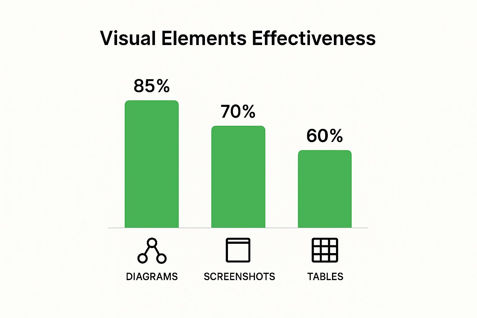
The numbers don’t lie. Well-designed diagrams can boost a user’s understanding by up to 85%, blowing simple screenshots or tables out of the water. This is a critical reminder to pick a toolset that makes adding and managing these kinds of powerful visuals as easy as possible.
Let’s be honest: dense blocks of text are where comprehension goes to die. In modern technical documentation, words are the foundation, but visuals and interactive elements are what make the whole structure usable. They are the bridge between knowing about a feature and actually understanding how to use it.
This isn’t just about making things look pretty. It’s about efficiency and clarity. Think about it: a single, well-annotated screenshot can explain a confusing UI far more effectively than three paragraphs of descriptive text ever could. Our brains are hardwired to process visual information quickly, so using images and diagrams is a powerful way to reduce the cognitive load on your reader.

The goal is to add visuals that bring genuine value, not just clutter up the page. Every image or diagram needs a clear purpose—to simplify, clarify, or demonstrate something specific. Just dropping a generic screenshot into a guide doesn’t cut it. The best visuals are tailored to the instruction at hand.
Here are a few types of visuals I’ve found to be incredibly effective:
This move toward rich media is completely reshaping how we build technical documentation. By 2025, the industry expects a huge jump in the use of videos and interactive diagrams. This isn’t a fad; it’s a direct response to how people work today.
For instance, a staggering 99.5% of field service technicians now use mobile devices to access documentation on the job. That reliance makes multimedia content a flat-out necessity. You can discover more about these technical documentation trends and see how they’re influencing a new generation of tools and standards.
When you start adding all these great visuals, you take on a critical responsibility: making sure they work for everyone, on every device. Your docs might be read on a huge developer monitor one minute and on a small tablet in a noisy server room the next. A non-responsive design can make your carefully crafted visuals completely useless.
This means your visual assets absolutely must be:
Building responsiveness and accessibility in from the start isn’t an afterthought—it’s a core part of the design process. It makes your content inclusive and effective for your entire audience, no matter who they are or what device they’re using. Honestly, it just saves you headaches down the line, improves user satisfaction, and builds trust in your product.
Great technical documentation isn’t a “set it and forget it” project. It’s a living product that has to evolve with your software. Without a solid maintenance plan, even the most brilliant docs will quickly become a liability—inaccurate, misleading, and a surefire way to frustrate your users. The goal here is to build a practical, sustainable cycle that keeps your content valuable over the long haul.