A complete sequence diagram tutorial for developers. Learn to create, read, and master UML sequence diagrams with practical examples and expert tips.
Let’s be honest—when you hear “UML,” you might picture dusty textbooks and design principles from a bygone era. But what if I told you one of its core components, the sequence diagram, is more critical now than ever? In our modern world of microservices and complex distributed systems, truly understanding the play-by-play of system interactions isn’t just a nice-to-have. It’s essential.
Sequence diagrams are brilliant because they slice right through the complex jargon. They give you a clear, time-ordered map of how different components talk to each other, acting as a universal translator for developers, architects, and even the non-technical folks on your team. That kind of visual clarity is priceless in modern software design.
Think about explaining a simple user login flow. You’d talk about the user entering their details, the frontend firing off a request, the backend checking credentials against the database, and the server sending back a token. It works, but it’s easy for details to get lost in translation.
A sequence diagram lays this all out visually, leaving no room for doubt:
This simple structure strips away ambiguity. It guarantees that everyone, from the junior dev to the project manager, is on the same page about how the system is supposed to work.
Sequence diagrams have been around since 1997, born out of the original Unified Modeling Language standard. They were created to do one thing very well: visually show the order of interactions between objects to make system behavior clear.
Even though they’re decades old, they’re still the go-to interaction diagram for most developers. Why? Because their simplicity is their strength. They focus purely on the sequential flow of messages, unlike other UML diagrams that get bogged down in system structure. You can dive deeper into their history and uses in this fantastic sequence diagram guide from Creately.com. Their longevity isn’t an accident; it’s proof of their enduring value in a development world that desperately needs clarity and precision.
To get anywhere with sequence diagrams, you first have to speak the language. Think of it like learning the basic grammar before you can write a compelling story. Once you nail down the core building blocks, you can map out even the most tangled system interactions with surprising clarity.
Every sequence diagram you’ll create is built from a handful of fundamental pieces that work together to show how different parts of a system talk to each other.

The two main players you’ll see are actors and lifelines. An actor, which looks like a simple stick figure, is any external entity kicking off an interaction—this could be a user clicking a button or even another system making an API call.
A lifeline, on the other hand, is that vertical dashed line you see. It represents a single participant in the process, like a web server, a database, or a specific microservice. It’s a visual timeline of that object’s existence during the interaction.
Messages are the real heart of the diagram. They’re the arrows zipping back and forth between lifelines, showing the actual communication, like function calls or data requests. You’ll run into a few different types, but two are absolutely critical:
When a lifeline receives a message and gets to work, you’ll see a thin rectangle pop up on it. This is called an activation box (or execution specification), and it shows exactly when that object is busy processing something. The longer the box, the longer the task takes.
To help you get comfortable with these symbols, here’s a quick reference table.
This table breaks down the most common symbols you’ll use in sequence diagrams. Think of it as your cheat sheet for identifying what each component does at a glance.
Having this table handy will make both reading and creating diagrams much faster.
Simple message flows are a good start, but real-world systems are full of forks in the road—conditions, loops, and optional steps. That’s where combined fragments come in. These are boxes you draw around a group of messages to introduce logic, turning your static timeline into something that truly reflects how the system behaves.
For instance, an **alt** (alternative) fragment is your basic if-else statement. You can use it to show two different paths: one for a successful login and another for a failed attempt. An **opt** (optional) fragment handles sequences that only run if a certain condition is met, like a user applying a discount code at checkout.
Then you have the **loop** fragment, which is perfect for repetitive actions. A great example is iterating through all the items in a shopping cart to calculate the final price.
Nailing these fragments is what separates a decent diagram from a genuinely useful one. In fact, clearly showing these logical flows is a core principle of good technical communication. You can see how this fits into the larger world of development by reading our guide on the best practices for documenting code.
Once you’re comfortable with actors, lifelines, messages, and these logical fragments, you’ve got everything you need to start mapping out complex system behaviors with confidence.
Alright, let’s ditch the theory and get our hands dirty. It’s one thing to talk about lifelines and messages, but the real “aha!” moment comes when you apply it to a situation you actually see in your day-to-day work.
We’re going to build a sequence diagram from scratch for a classic scenario: an e-commerce order placement. This isn’t just about drawing boxes and arrows; it’s about the thinking that goes into every single line—creating a diagram that’s not just technically correct, but actually useful to your team.
First things first: you have to define your scope. If you try to diagram an entire e-commerce platform in one go, you’ll end up with a tangled mess that helps no one. It’s a rookie mistake. Instead, we’ll zoom in on a single, successful workflow: a customer placing an order.
So, who’s involved? Let’s identify the key players in this specific interaction:
By setting these boundaries, we keep the diagram focused and readable.
With our cast of characters defined, we can start mapping the sequence of events. Think of it like a script. We’ll follow the interactions chronologically, from the customer’s first click down to the final confirmation.
This is where the magic happens. You start by sketching out the basic flow, visualizing how these different systems talk to each other.
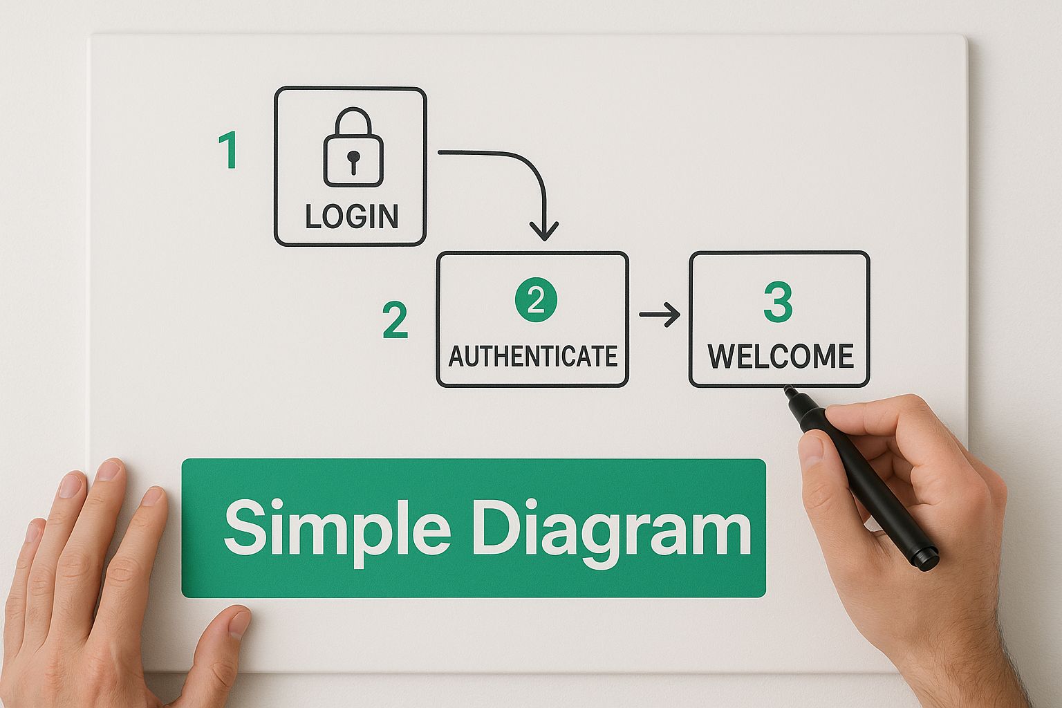
As the image shows, you don’t need fancy tools to get started. The most effective diagrams often begin with simple, well-defined components. It’s all about building a clear, methodical foundation.
Now, let’s bring in some real-world logic. A successful order isn’t just a straight line. What happens if the payment fails? This is where combined fragments come into play. The **alt** (alternative) fragment is perfect for this kind of scenario. It lets you draw a box around a section of your diagram and define two or more paths: one for success and another for failure.
This keeps your diagram clean while still accounting for the different ways an interaction can play out. It’s how you show decision points without creating a confusing web of arrows.
Look, a sloppy diagram is worse than no diagram at all. To make something truly effective, you need a bit of discipline. I’ve seen countless teams make the same mistakes, but a few core rules can make all the difference.
An insightful UML sequence diagram tutorial I often recommend boils it down to three things:
Following these simple steps can slash common diagramming mistakes for newcomers by as much as 40%. It’s about creating clear visual logic that genuinely supports your development process, rather than just ticking a box for “documentation.” When done right, your diagram becomes a reliable blueprint everyone on the team can follow.
Picking the right tool can be the difference between a sequence diagram feeling like a chore and it being a genuinely helpful part of your design process. The “best” software really comes down to your personal workflow, how your team operates, and what you need the final diagram to do.
Broadly speaking, you’ve got three camps to choose from. The first big decision is whether you want to go visual or text-based.
Visual editors with a drag-and-drop interface, like Lucidchart or Miro, are fantastic for getting ideas down quickly. They feel a lot like building a slide deck. This makes them perfect for collaborative brainstorming, especially when non-developers are in the room. You can get a professional-looking diagram without a steep learning curve.
Then you have the text-based tools, like PlantUML or Mermaid. These are a developer’s dream because they let you define your diagram with simple code, often right inside your IDE. Instead of fiddling with boxes and lines, you write a few lines of declarative text, and the diagram generates itself.
This “diagrams as code” approach is popular for a few big reasons:
Sure, there’s a little syntax to learn, but the payoff of having your diagrams live and evolve with your codebase is a huge win for most engineering teams.
The third category is the heavy-duty, dedicated UML applications like StarUML. These are powerful, feature-rich platforms built specifically for formal software modeling. They’re not just for sequence diagrams; they handle the entire suite of UML diagrams. This makes them a go-to for software architects and teams working on large, formally documented systems.
No matter which path you take, collaboration is key. A crucial factor today is whether the tool functions well for distributed teams. It’s smart to consider platforms that are also recognized as effective Collaboration Tools for Remote Teams, as this ensures everyone can contribute seamlessly.
Features like real-time commenting, version history, and one-click sharing aren’t just nice to have anymore; they’re essential for keeping everyone on the same page.
To help you decide, here’s a quick breakdown of some of the most popular options out there.
This table compares some leading tools to help you find the best fit for your workflow.
Ultimately, the right tool is the one that removes friction, not adds it. Your goal is to find a platform that balances ease of use with the powerful integration and collaborative features your team needs to get the job done.

Let’s be honest: basic sequence diagrams are great for simple, linear workflows, but real-world systems are rarely that neat. They’re messy. They involve parallel tasks, complex error-handling, and edge cases that a simple top-to-bottom diagram just can’t represent accurately.
If you want to create a diagram that truly reflects how your system behaves under pressure, you need to bring in a few advanced techniques. These methods are what separate a quick sketch from a powerful design document—the kind that’s genuinely useful for debugging thorny issues and communicating a clear vision for handling concurrency and failure.
Modern applications are constantly juggling multiple operations at once. Think about a user dashboard that needs to load profile information, recent activity, and notifications all at the same time. If you try to map this out with standard synchronous messages, you’ll end up with a diagram that’s not just wrong, but actively misleading.
This is exactly where the **par**** (parallel) combined fragment** comes into play. You can wrap these concurrent interactions inside a par block, separating them with a dashed line. It’s a simple visual cue that instantly tells the reader: these things—like multiple API calls—are happening in parallel, not one after the other.
This technique is a lifesaver for scenarios like:
Using a par fragment makes your diagram a much more honest reflection of modern, non-blocking system architecture.
You can often judge a system’s quality by how it handles things when they go wrong. While the alt fragment is perfectly fine for simple if-else logic, real-world error handling is usually more layered. You might be dealing with a full try-catch-finally block or a whole series of validation checks before an operation can proceed.
For these gnarly situations, you’ll need to combine fragments. A **critical**** fragment**, for instance, can show a section of an interaction that must be atomic—it absolutely cannot be interrupted by other messages. Inside that, you could nest an alt fragment to show what happens on success versus what happens on failure.
Getting these interaction logics right is a huge deal on any large project. In my experience, effective sequence diagrams can account for 70%-80% of successful design communication. They can also slash later-stage debugging costs by up to 30% by catching design flaws before a single line of code is written.