Learn how to generate a UML diagram from code instantly. Find tips on setup, customization, and workflow integration to visualize your software effectively.
Let’s be honest: keeping software diagrams in sync with a constantly evolving codebase is a headache every development team knows well. For years, the go-to method was to manually draw UML diagrams in tools like Visio or Lucidchart. But this approach is slow, riddled with potential for human error, and almost always disconnected from what’s actually in the code.
That disconnect is a huge problem. A diagram meticulously drawn last month is probably already obsolete after a few sprints. It becomes unreliable for onboarding new developers, useless for design reviews, and a risky foundation for planning future work. This is exactly where generating a UML diagram from code changes the game entirely.
Trying to keep up with manual diagramming in a fast-paced environment throws a few persistent wrenches in the works:
This old-school approach treats documentation like a chore—a separate, annoying task tacked onto the development lifecycle instead of being an integral part of it.
This is where tools like DocuWriter.ai come in. They completely flip the script by reverse-engineering your source code to create accurate, up-to-the-minute visualizations. Instead of dragging and dropping boxes and lines, you just point the tool at your repository. It gets to work analyzing the structure, classes, and relationships, generating a precise UML diagram automatically.
Adopting this “documentation-as-code” mindset ensures your diagrams are always a true reflection of your system’s architecture.
This is especially vital in complex software ecosystems. Take Java development, for instance. Reverse engineering UML class diagrams from source code is a common practice for making sense of massive, enterprise-level architectures. In fact, over 70% of surveyed Java development teams said that integrated UML tools dramatically improved their ability to document complex systems, which led to faster onboarding and fewer integration mistakes. You can dig into more of these insights on Java project visualization on lambdatest.com.
Here’s a great example of a tool analyzing a Java project to spit out a UML diagram.

You can see how the tool is parsing the source code tree on the left and generating the corresponding class diagram on the right, automatically mapping out all the relationships and dependencies. No guesswork involved.
Let’s break down the real-world differences.
By automating this process, you give your team access to live, accurate visualizations without slowing down the development pipeline. Documentation stops being a bottleneck and becomes a seamless, valuable byproduct of your workflow.
Alright, let’s get down to the fun part: moving away from the soul-crushing drag of manual diagramming. The very first thing you need to do is give DocuWriter.ai a look at your code. This is where the magic starts—bridging the gap between your actual source code and the powerful visualization engine that will map it all out for you. The whole point is to get you up and running in minutes, not hours, so you can generate a UML diagram from code almost instantly.
The process is straightforward. You’ll create an account and then link up your code repository. DocuWriter.ai hooks directly into the tools you already use, like GitHub and GitLab, using secure methods like OAuth. This means you grant access without ever handing over your passwords.
I get it. The idea of giving a tool access to your intellectual property can be nerve-wracking. This is a common and totally valid concern.
When you connect your repository, DocuWriter.ai only requests read-only permissions. This is a non-negotiable security measure. The tool only needs to read your code to understand its structure; it never, ever needs permission to write, change, or delete a single line.
This read-only access allows the platform to perform a static analysis of your code. It scans the files to pick out classes, methods, and attributes, and more importantly, figures out how they all relate to each other—things like inheritance and composition. Your code is analyzed on the fly, and crucially, it is not stored on DocuWriter.ai’s servers once the job is done. Your codebase stays right where it belongs: safe and sound in your own version control system.
Let’s say you’re knee-deep in a Python/Django project. Your repo is a maze of apps, models, views, and helper modules. By connecting that repository, you’re letting the tool map out how your User model connects to an Order model, or see how a particular view class inherits from a generic Django view. It untangles the web for you.
This infographic shows just how simple the workflow is—from parsing your code to generating diagrams that actually help your team.
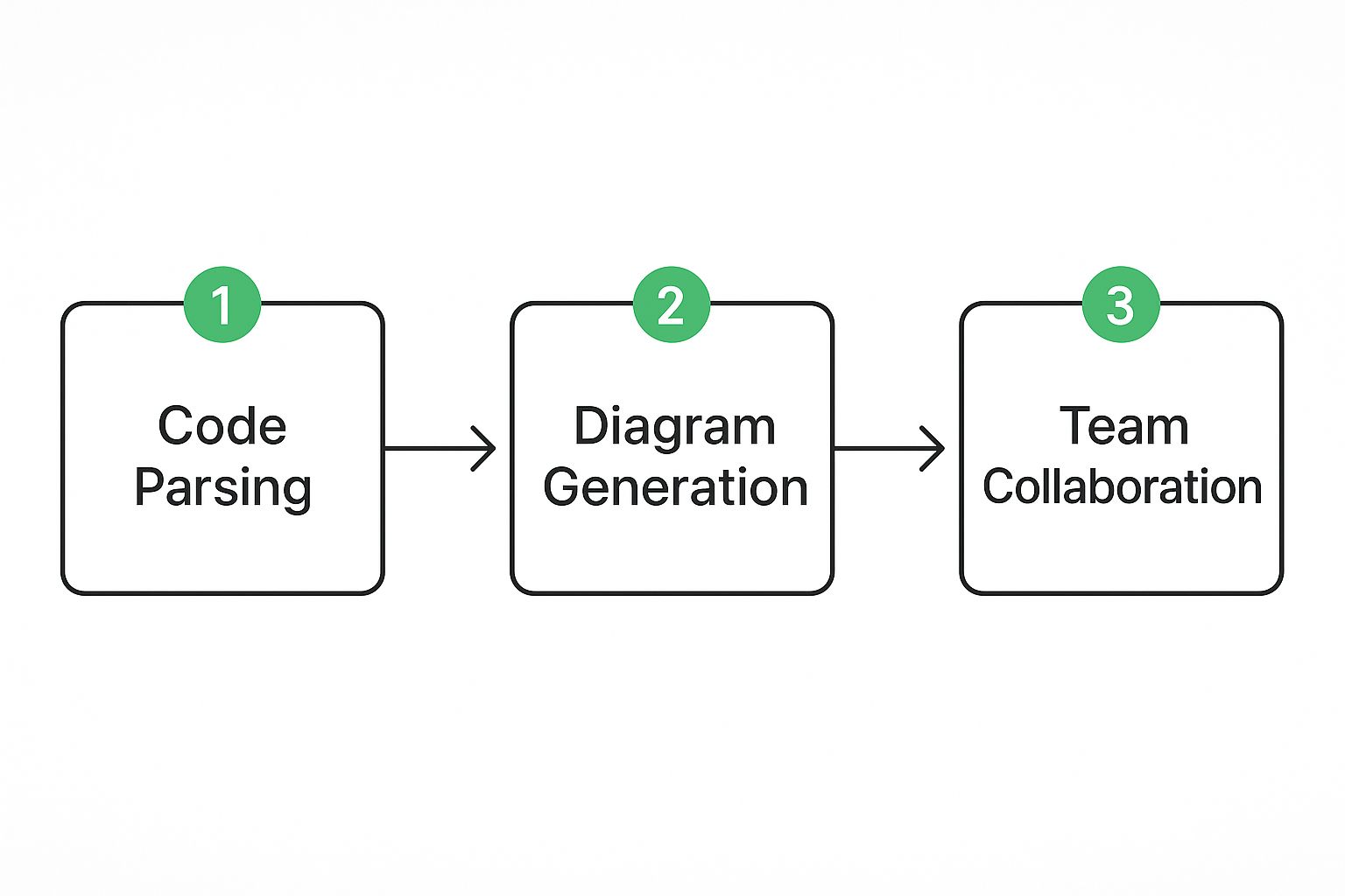
As you can see, it’s a clean, linear process. Secure code analysis is the bedrock, leading directly to tangible benefits like better team alignment and easier collaboration.
Once you’ve authenticated through your GitHub or GitLab account, you’ll be presented with a list of your available repositories. We designed the setup to feel completely natural.
main or development branch to get a snapshot of the current codebase. But you can also aim it at a feature branch to visualize changes before you merge them—a super useful trick.myproject/apps/payments/ to generate a UML diagram focused exclusively on your payments module.This initial setup is a one-and-done deal for each project. After that, creating an updated diagram is as simple as clicking a button. This is what makes automated documentation so powerful; it ensures your architectural diagrams never fall out of sync with your code, killing the problem of outdated manual drawings for good. Now, the system is ready for the heavy lifting, and you’re just a click away from your first visual artifact.
Alright, you’ve connected your repository to DocuWriter.ai. Now for the fun part: turning all that abstract code into something you can actually see and understand. This is where the magic happens, where the hidden architecture buried in your files and folders finally comes to life.
We’re about to kick off the analysis and generate your very first UML class diagram. The goal here is to get a baseline—the raw, unfiltered truth of your system’s design.
The process itself is straightforward. You just pick your repo and tell the tool to get to work. DocuWriter.ai will then dive into your codebase, parsing every class, method, and attribute. More importantly, it maps out all the critical relationships connecting them—things like inheritance, composition, and associations.
What you get back is a complete, unvarnished map of your system.

This first diagram is meant to be a direct reflection of your code’s structure. It’s the essential starting point before you start tweaking and refining it for specific presentations or reports.
When that first diagram pops up, it’s going to be a direct, one-to-one translation of what the analysis engine found. It’s designed to be exhaustive, which can feel a bit… much. Especially on larger projects. Don’t sweat it; that’s exactly how it’s supposed to be.
Think of it like a freshly quarried block of marble. The finished sculpture is in there somewhere, but first, you have to chip away the rough edges to reveal its true form. Your initial UML diagram from code will probably show you:
This initial view is your ground truth. Every single box and line on that diagram has a direct counterpart in your source code, giving you an undeniable snapshot of your system’s design right now. For a deeper dive into what these elements mean, check out our guide on https://www.docuwriter.ai/posts/how-to-create-uml-diagram.
Here’s where the real power of this approach shines: the direct link from the diagram straight back to your codebase. When you see a class labeled UserService on the diagram, you know for a fact there’s a UserService class file in your project. The methods and attributes listed inside that box aren’t just guesses; they’re pulled directly from the public methods and properties defined in that class.
This tight coupling is what makes automated diagramming so much better than drawing things out by hand. There’s no room for misinterpretation or human error. If the diagram shows a User class inheriting from BaseModel, you can be 100% confident the code says class User extends BaseModel. It’s that simple.
This kind of automation is getting smarter all the time, too. With large language models (LLMs) being integrated into these tools, generating complex diagrams from both code and natural language has improved dramatically. Research consistently shows that advanced models like GPT-4o are getting exceptionally good at creating accurate and readable UML, promising to slash the manual effort involved.
Ultimately, this traceability turns the diagram into an actionable tool. You can use it to navigate your codebase, onboard a new team member by showing them the key interactions, or plan a major refactoring effort with a clear visual guide. The diagram stops being just documentation and becomes an interactive map of your software.
Right, so you’ve just used an AI tool like DocuWriter.ai to spit out a UML diagram from your codebase. What you’re looking at is a raw, unfiltered snapshot of your architecture. It’s a solid starting point, but let’s be honest, it can be a bit of a mess. It shows everything, and that’s both its strength and its weakness.
The real magic happens when you step in. You’re not just a user; you’re the expert who knows the why behind the code. Your job now is to take that raw output and sculpt it into something that tells a clear, focused story.
A diagram generated from a modern codebase, especially something like a Spring Boot app, is going to be loaded with stuff you don’t care about. Think about it: do you really need to see every single internal class from the Spring Framework? Probably not. That’s just clutter.
This is where you need to be ruthless with filtering. DocuWriter.ai gives you some powerful options to hide the non-essentials so you can focus on your own application logic.
You’ll want to immediately hide things like:
org.springframework.* or django.db.*.Filtering these out instantly makes your diagram cleaner and lets the core components of your system shine through. It’s the single most important step in creating a useful UML diagram from code.
This subtractive approach saves a ton of time and puts the focus squarely on your custom code from the get-go.
With the clutter gone, it’s time to organize the layout. An automated tool arranges elements based on algorithms, not on the logical flow of your application. You’re the one who understands that flow.
Think like you’re explaining the system to a new team member. Where does a request start? What’s the most critical component? Arrange the diagram to tell that story visually.
These manual tweaks transform a static diagram into a guided tour of your architecture. It helps others grasp the system’s structure without you needing to stand over their shoulder and explain it.
A clean layout is a huge win, but we can do better. This is where you layer your expert knowledge directly onto the diagram, turning it from a simple chart into a true piece of documentation.
Color-coding is a simple but incredibly effective trick. You could make all your Data Access Objects (DAOs) blue, API controllers green, and maybe highlight any classes slated for a future refactor in red. It provides instant visual context that a monochrome diagram just can’t match.
Don’t forget to add notes and annotations. If a relationship between two classes is a bit weird or non-obvious, drop a small text box next to it to explain why it’s there. A quick note like, “This service uses the Strategy pattern to handle different payment providers,” can save someone hours of head-scratching.
These final touches answer questions before they’re even asked. A well-annotated and color-coded diagram isn’t just a picture of your code; it’s a powerful tool for design reviews, sprint planning, and getting new developers up to speed, fast.
Creating a sharp, accurate UML diagram from code is a fantastic first step, but it’s only half the battle. A diagram’s real power comes alive when it’s an active part of your team’s everyday process. If it just sits inside a tool, it’s nothing more than a static picture. The final, most crucial move is to weave it into your documentation, version control, and collaboration platforms. This is how you turn a simple visualization into a living, breathing document.
How you share your diagram really depends on what you’re trying to achieve. DocuWriter.ai gives you a few different export options, and each one is built for a specific job. Picking the right format is the key to making your diagrams useful communication tools instead of just digital dust bunnies.

Let’s walk through the common formats and see where they actually fit into a developer’s workflow. The choice you make here has a direct impact on how your team uses the architectural insights you’ve just uncovered.
The Diagram as Code (DaC) approach is a game-changer. Instead of dealing with diagrams as separate, manually updated files, you treat them as artifacts generated from a simple text definition. You can store this text right in your repository, maybe in a docs/ folder or even inside a README.md.
This model fits perfectly with how we build software today. DaC tools like Mermaid and PlantUML let developers version control diagrams just like any other piece of code. With this setup, you can even automate diagram generation in your CI/CD pipeline. Imagine this: every time code gets merged into the main branch, a script automatically regenerates the key architectural diagrams. They are never out of date.
This isn’t just a niche idea; it’s gaining serious momentum. Some surveys show that up to 60% of DevOps teams in forward-thinking organizations are already baking DaC into their workflows.
Picking the right export format isn’t just a technical detail—it determines how useful your diagram will be to your team. Whether you need a quick shareable image, a high-fidelity document asset, or a version-controlled file, there’s a format for the job. This table breaks down your options to help you decide.
Ultimately, using a mix of formats is often the best approach. Use text-based formats as your single source of truth in your repository, and generate PNGs or SVGs from them as needed for different audiences.